Action Ally
“When procrastination is your enemy, you need an Action Ally”
In this UX case study, I will share my design process and approach to creating a wellness app within a tight timeline of 9 days. The goal of the app was to address bad emotional habits, with a focus on procrastination and perfectionism, as identified through user research.
Background
Survey Research
To start the design process, I conducted user research to understand the pain points and needs of the target audience. I created a survey and collected responses from a sample of 51 individuals to identify what bad emotional habits they experience, and then use the insights to guide my subsequent research. The survey results revealed the following insights:
4 out of 5 people suffer from procrastination
2 out of 3 respondents are self-reported perfectionists
Activity tracking & Personalization were cited as most helpful features of wellness apps
Interviews
I interviewed 5 people to understand their experience with procrastination and perfectionism. I gleaned the following information that propelled my project:
Procrastination is a repeated pattern based on comfort
Self-directed solutions included creating situations that were purposely stressful to complete tasks
Patterns of self-handicapping if they do not think they can accomplish the task perfectly
“I only knock out tasks under extreme duress”
“Procrastination has ruined my life, literally”
“If I want to procrastinate, I will work around any app that tries to block something I want as a distraction”
Brainstorming & Ideation
During my research, I discovered numerous causes of procrastination and explored various anti-procrastination applications already on the market. However, I noticed a significant gap in the tools available. While many tools block access to distractions, they do not address the underlying causes of procrastination or help users overcome the urge to procrastinate.
To address this gap, I began brainstorming potential solutions that would help users tackle the root of their procrastination problem. I delved into secondary research and found studies that used psychological interventions to achieve statistically significant improvements in participants' procrastination habits.
Drawing from this research, I developed a solution that prompts users to reflect on their emotional responses to certain tasks and provides non-judgmental advice on how to approach them. Additionally, the tool encourages users to be mindful of the reasons behind their aversion to a task. I chose the name Action Ally to convey a sense of support and kindness in tackling procrastination.
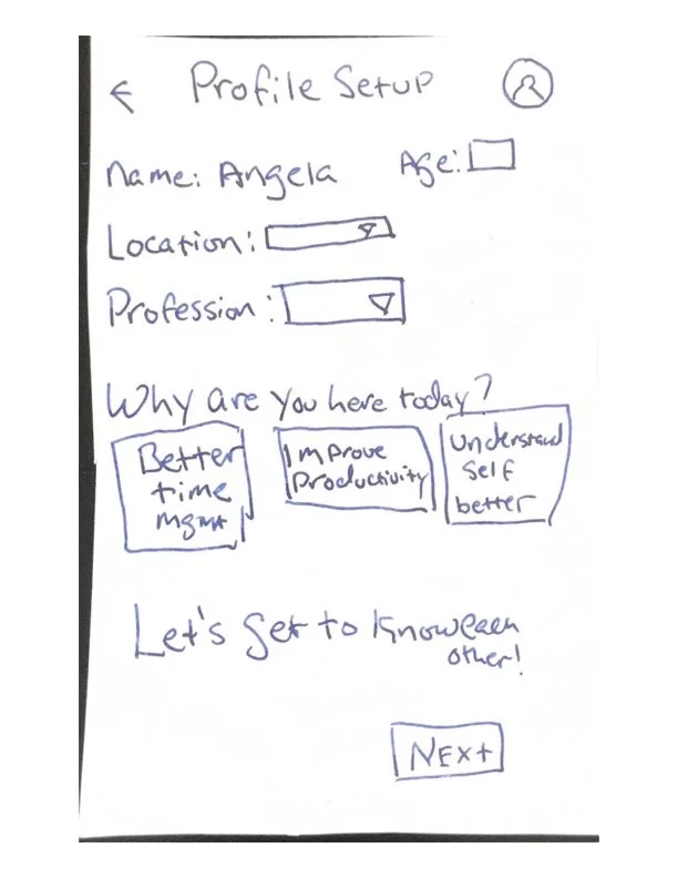
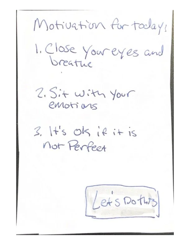
To begin the design process, I created low fidelity mockups of the app using pen and paper. These mockups were intentionally rough and basic, with minimal details and no color. I then conducted user testing sessions with a small group of users to gather feedback on the mockups.
Through these testing sessions, I was able to identify several key user needs and improvements that the app should address. For example, I received feedback that the onboarding survey was too long, users wanted to understand why the questions were being asked, and requested a tool bar at the bottom of the app.
Lo-Fidelity Prototype




Mid-Fidelity Prototype
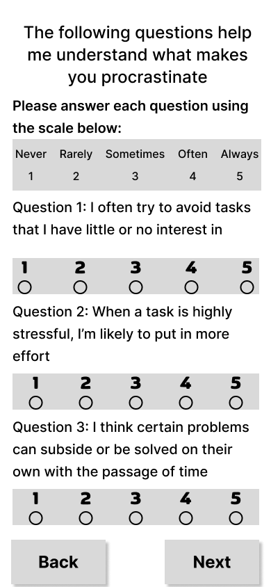
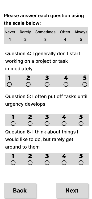
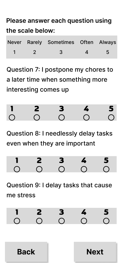
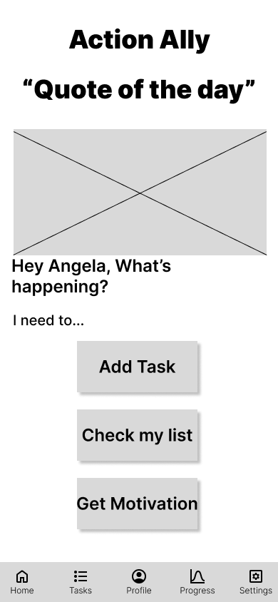
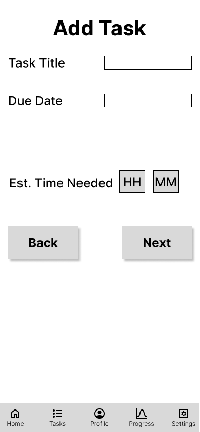
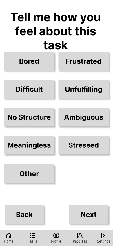
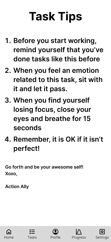
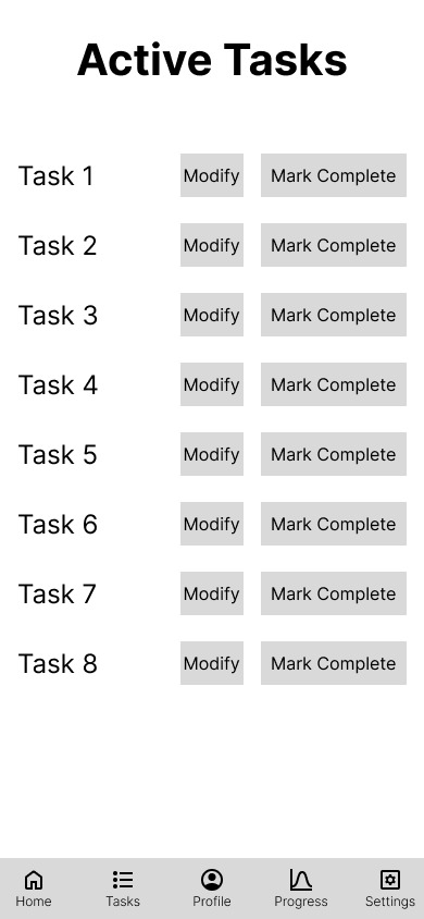
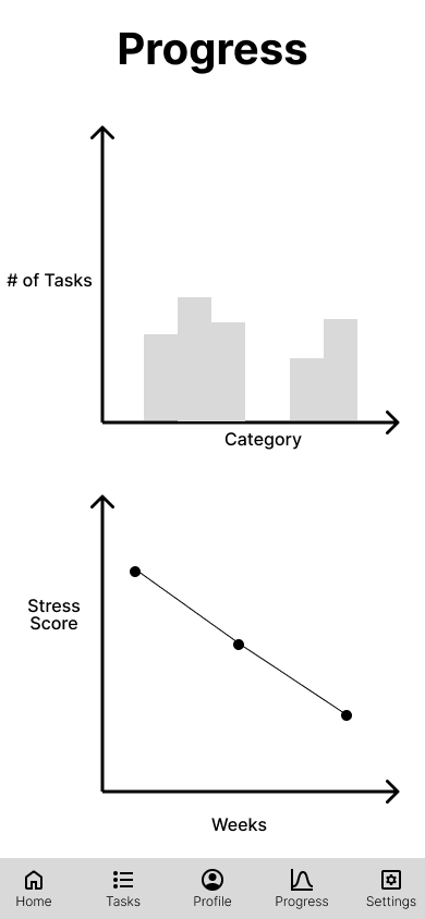
After conducting low-fidelity usability testing, I created a mid-fidelity wireframe using Figma. This allowed me to focus on the usability, features, and flow of my solution without getting bogged down in visual design. By using only black and white, I was able to keep my attention on the core components of my design. I also prototyped each screen to test the flow and usability of my design. One of the benefits of using black and white was that it allowed me to quickly iterate on my design and make changes based on user feedback. Throughout this stage, I paid close attention to the details of each screen, including the specific components I included and how they worked together. By doing so, I was able to create a mid-fidelity wireframe that effectively communicated my design ideas and set me up for success in the final, high-fidelity stage.



High Fidelity Design - Style Tiles
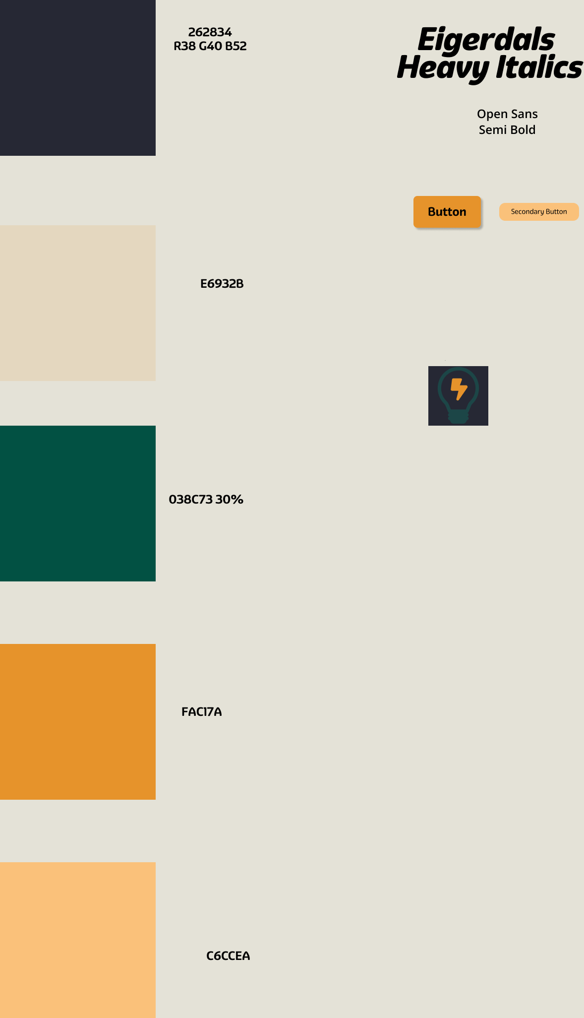
Before beginning my high-fidelity design, I choose a color scheme and fonts to represent Action Ally. I choose colors that were calming, non-judgmental, and encouraging. For my font, I choose Eigerdals because it presented a classic and readable feel.
High Fidelity Prototype
After conducting usability testing on my mid-fidelity prototype, I started the construction of my final high fidelity design and prototype. I received feedback in while conducting usability testing on my mid-fidelity prototype including:
Expanding the button width on home screen
Create a task shortcut on home screen
Add a progress bar during onboarding survey
Reword the survey questions to be affirmations
Using this feedback, I designed and prototyped my final version of Action Ally. The video below shows the prototype
My next steps from this project are to:
Conduct an A/B test to see if the app works as intended
Create additional color and font styles to conduct desirability testing
Develop and prototype additional interventions using subject matter experts.