Tibber
Onboarding the Electric Revolution
Introduction
For my final project at Ironhack, I decided to work with a client called Tibber, an electric provider in Norway, Sweden, Germany, and The Netherlands. Tibber’s ask was reinvent the onboarding process for new customers to lower the amount of time for customers to have their ‘aha’ moment.
Tibber is a different kind of electric utility. Their business model works by not charging a markup on the power provided to customers, but through a nominal monthly fee and selling energy efficient products called ‘Power Ups.’ Tibber customers are charged the marginal price of energy during the period of consumption, and have information in the Tibber app about current prices. The ‘Power Up’ products allow customers to reduce their overall energy usage or to use energy when it is cheapest. Tibber management had found that many new customers do not know nor use the additional features available to them as customers. Their ask was to overhaul their current new customer onboarding in a way that is informative, engaging, and educational.
User Research
The first question I asked myself when beginning the project was, “what is electric utility onboarding?” Here is a photo of myself pondering this question on a train between Lisbon and Casais:
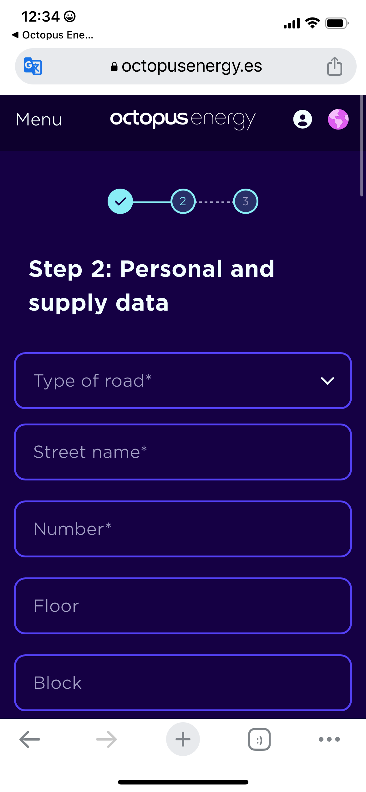
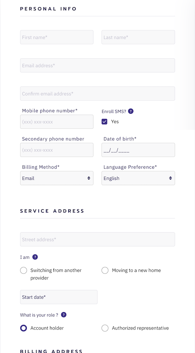
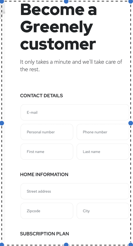
I used this fundamental question to guide my initial research. I looked up Tibber’s competitors and looked at how they onboard customers. Here are a few of the screens below:
After this revelation I asked myself what could I do to make a lackluster process engaging and interesting.


Five more seconds…
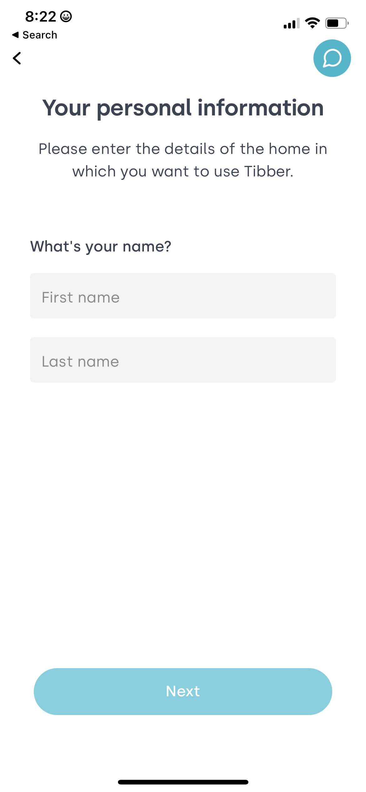
Does anything strike you about these screens? Pause and Ponder for a moment.
THEY ARE ALL THE SAME! Am I wrong? I do not think so.
An interlude (I promise it ties in)
Now let me tell you a story, because who doesn’t like stories. A few years ago I bought my first house, but had to endure “Under Contract” month before I could be a bonafide homeowner. For those of you who have been through this process, you might remember the frantic calls from your realtor and lender demanding tax documents, bank statements, pay check stubs, a DNA sample..OK I am kidding about the last one, and a homeowners insurance policy.
Of all the things I dreaded doing, it was shop for insurance. While searching for insurance companies, I ran across a new provider called Lemonade. After chatting with “Maya” for about 8 minutes, I had a homeowner insurance policy. I was shocked at how easy and dare I say fun the process was. It was the most excellent onboarding experience I ever had.
I had my own ‘aha’ moment! Let’s turn Tibber’s onboarding on its head and create a chat onboarding!
Usability Testing of Current Flow

I conducted usability testing on the current Tibber onboarding sequence and had four user interviews with Tibber customers. My main findings from my research were:
The current onboarding was unremarkable and basic
Interviewees did not understand the full value proposition of Tibber’s product
They did not understand what they received for their monthly €3.99
Only choose Tibber because they have the cheapest rates
Customers did not know what a ‘Power Up’ was and how it could help them
Overall distaste for filling out forms on their phone
Problem Statement and How Might We
From my research I devised the following problem statement and How Might We:
New Tibber customers need a way to onboard that teaches them the benefits of Tibber and while efficiently creating their account so they can save costs on energy, reduce their carbon footprint, and live a more sustainable lifestyle
How might we shorten the amount of time it takes a customer to realize the value of Tibber?
Brainstorming & Ideation
Before creating my first low-fidelity prototype, I wanted to concept test the chat onboarding concept against a spruced up version of the current onboarding flow. The results of the concept test were clear. Users preferred the chat onboarding to the traditional.
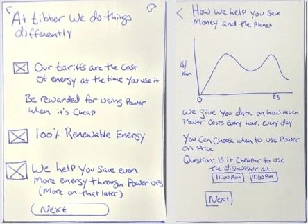
Traditional

Low & Mid Fidelity Prototyping
Accessibility Testing
Chat
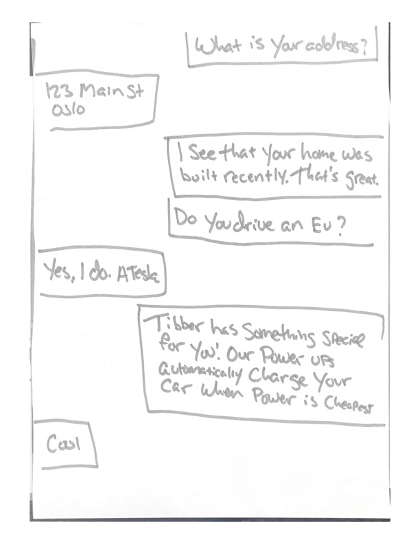
After I completed concept testing, I created a low-fidelity mockup of the chat version of Tibber, which I then user tested.
I received feedback during my low-fidelity usability testing to:
Use less technical language in the chat flows
Change the order of chats to reflect how text messages are seen on a phone
Provide the user suggestions for answers to reduce the amount of typing required
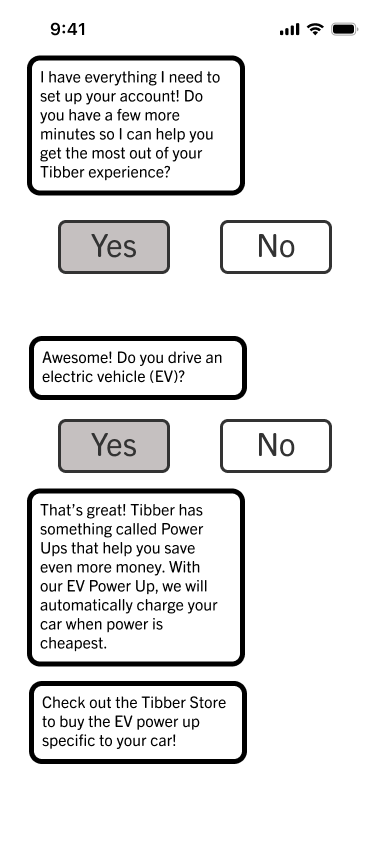
Using these suggestions, I created my mid-fidelity wireframe in Figma. I then conducted a second round of usability testing where I received the following feedback:
Decrease the stroke of chat bubbles
Require the user to learn about ‘Power Ups’ during the onboarding flow
Increase button and font size
Below is an example of the evolution from low to mid fidelity prototypes:
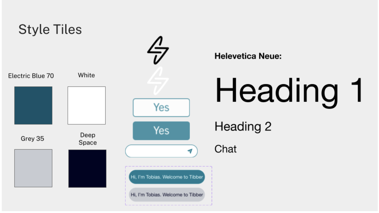
Here are the style tiles I created for my high fidelity prototype:
One of the most important concepts taught during our bootcamp was the importance of making our designs accessible for people with visual disabilities. To accomplish this, I used the Figma plugin, Contrast, to measure the contrast between colors to ensure it met the Web Content Accessibility Guidelines (WCAG) AA standard.
First, I tested Tibber’s current brand color combination, Electric Blue and White, and found that it failed the WCAG, AA guidelines for both small and large text. Tibber’s brand guidelines offered various shades of their brand colors. After testing various combinations, I decided to use Electric Blue 70 with White and Deep Space with Grey 35, which met WCAG AA guidelines.
Style Tiles
High Fidelity Prototype
Without further ado, I present my final, high fidelity prototype:
Takeaways and Next Steps
My next steps for this project are:
Conduct A/B testing to compare conversion rates and digital engagements between current onboarding flow and chat flow
Write and design ‘unhappy’ path and error states
Create additional chat personalizations for ‘Power Ups’ based on how users answer questions during onboarding